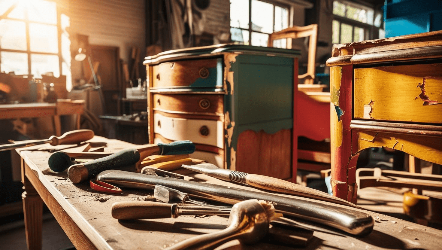
Hey everyone! If you’ve ever stood in the paint aisle wishing there was just the right glaze color for your project, this one’s for you. I recently experimented with tintable glaze for the first time and decided to make my own custom color using Pearl Ex powdered pigments from Jacquard. I’m officially hooked.

Why I Made My Own Glaze
Let’s be real: premade glazes are expensive and come in limited shades. I paid $5 for one tiny pot and ended up with a color I couldn’t even use. So, I decided to take matters into my own hands (as usual).
I used Modern Masters tintable glaze, which specifically says not to mix it with paint—it’ll dry too fast. Instead, it needs to be tinted with universal colorants or pigments. That’s where the Jacquard Pearl Ex pigments come in. I found mine at Blick, but you’ll save 20% right now if you order online with code PEONY—don’t miss it! I used a gorgeous Flamingo Pink, but spoiler alert—I ended up adding some purple to get the look I wanted.


Above you can see the piece with just pink paint on it. It’s very flat and I wanted to add more dimension and movement to this piece. A glaze is a slightly darker shade can help with this.
Mixing the Glaze
This was a bit of a mystery, honestly. There’s almost no guidance out there on how to mix this stuff. Modern Masters, we need to talk. 😅
Here’s what I did:
- I filled a small container a quarter of the way with glaze.

- I slowly added pigment and mixed it with a high-end mixing tool (aka a popsicle stick from Dollar Tree).

- Then I filled the rest of the container, knowing it would lighten the color.
- Since it was thicker than I expected, I thinned it with a little water. It’s water-based, so it worked perfectly.
I wanted a soft, girly glaze for an old music cabinet I’d converted into a nightstand. Once I tested the first mix, I realized it was too light. So I went back in with more pigment—and eventually brought in the purple!
Application Tips

A few things I learned the hard way:
- Make sure your piece is sealed before glazing. I applied a clear coat to keep it from soaking in.
- Work in sections and use a wet brush to soften and move the glaze around.
- A figure-eight motion helps blend without harsh lines.
- Darker glaze colors work better for that mottled, layered effect.
The Final Look
Once it dried, the cabinet had this dreamy, vintage finish—pink with just enough movement and depth. It didn’t look “dirty” (my usual complaint with glazes), just soft and elegant.

I’m thrilled with how it turned out. Now this piece has dimension and movement. It’s interesting to look at which is something I love. And, I love that I can now mix any color I want using just the glaze base and Jacquard PearlEx powdered pigments. It’s more economical and I get full creative control.
Final Thoughts
Would I create my own glaze again? Absolute! The Pearl Ex Powdered Pigments give me so many options for customizing furniture. It will allow me to make one of a kind pieces and I love the idea of not looking like everyone else.
If you want to try this at home, start small. Pick up a single Pearl Ex pigment instead of a whole kit and see how you like it. And don’t forget: contrast matters. My biggest takeaway is that the glaze needs to be darker than your base color if you want that lovely dimension. And here’s the best part—right now you can get 20% off when you shop online with my exclusive coupon code PEONY. Don’t wait—this is the perfect time to experiment and save!

Have questions? Want me to try a different product or show you more techniques like this? Drop a comment below—I love hearing from you!
📣 Let’s Stay Connected!
No matter where you scroll, I’m sharing tips, tricks, and creative projects to inspire your next flip. So pick your place and hit that follow button—I’d love to have you along for the ride!
Share this post!
💬 Know someone who’d love this project? Share it on Pinterest or Facebook and help spread the vintage love.

Until next time,
Happy Junkin’!
– Stacy